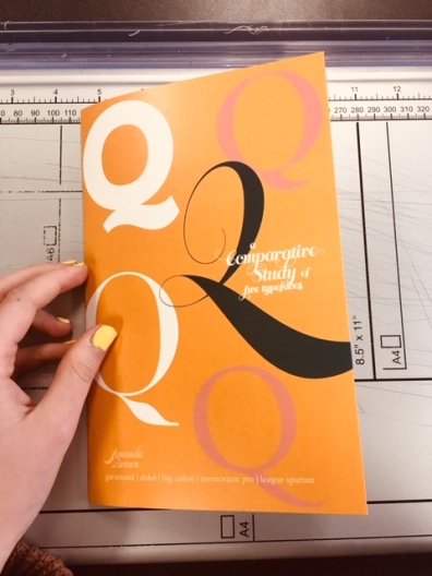
for my end of the year project, i was tasked with creating a type comparison booklet. I used typefaces from the magazine I run (Oh Beloved One) because I thought that would make the research more interesting.

I mentioned the cover and someone was like we already know it’s gonna be yellow. well, they weren’t wrong!!
The nice thing about doing magazine layout almost 24/7 is that most people would be overwhelmed with an assignment like this, but thankfully I already had an idea and layout in mind. 
I’ll be back with more prose soon!


